Create a Code Snippet Component

While developping a dumb library called wtfui that I do for fun and to learn some stuff, I needed to create a component that would display a code snippet. I wanted to be able to display a code snippet with a title, a language and a copy button.
I looked for the simplest and it seems that there is not a straight forward way to do it. I checked what famous library where doing like material ui or primeng.
On primeng I did not find any component that would do that. On material ui I found something interesting.
Material UI way
The component list
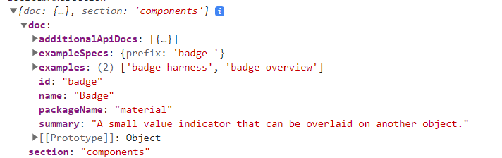
Everything start from src/app/shared/documentation-items/documentation-items.ts line 57 where all components are listed.
Then on line 596 theses componentes are processed to find the examples components, that are the one we want to display in the documentation.
function processDocs(packageName: string, docs: DocItem[]): DocItem[] {
  for (const doc of docs) {
    doc.packageName = packageName;
    doc.examples = exampleNames.filter(key =>
      key.match(RegExp(`^${doc.exampleSpecs.prefix}`)) &&
      !doc.exampleSpecs.exclude?.some(excludeName => key.indexOf(excludeName) === 0));
  }

  return docs.sort((a, b) => a.name.localeCompare(b.name, 'en'));
}
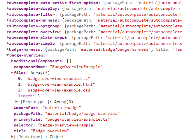
The variable exampleNames is from the line 40 and is just the keys of EXAMPLE_COMPONENTS which come from another library @angular/components-examples that is a dependency of @angular/components-examples.
const exampleNames = Object.keys(EXAMPLE_COMPONENTS);
This library is in the main repo angular/components, and it’s apparently generated by a script. But it does not matter for now. Here is what it looks like:
Then from this data they are reformating the tab to something like that
On the component that is the page template the data is loaded based on the url.
Exploiting the data
From this data an url is generated in ComponentOverview
 <doc-viewer [documentUrl]="getOverviewDocumentUrl(docItem)"
      class="docs-component-view-text-content docs-component-overview"
      (contentRendered)="updateTableOfContents('Overview Content', $event)">
getOverviewDocumentUrl(doc: DocItem) {
    // Use the explicit overview path if specified. Otherwise, compute an overview path based
    // on the package name and doc item id. Overviews for components are commonly stored in a
    // folder named after the component while the overview file is named similarly. e.g.
    //    `cdk#overlay`     -> `cdk/overlay/overlay.md`
    //    `material#button` -> `material/button/button.md`
    const overviewPath = doc.overviewPath || `${doc.packageName}/${doc.id}/${doc.id}.html`;
    return `/docs-content/overviews/${overviewPath}`;
}
The url of the badge component will be /docs-content/overviews/material/badge/badge.html
The doc-viewer component is a component that will load the html file and display it. The URL that is fetch by the doc-viewer is defined in the angular.json assets
{
  "glob": "**/*",
  "input": "./node_modules/@angular/components-examples/",
  "output": "/docs-content"
},
As we can see it’s coming from the @angular/components-examples library, which was previously used to defined the EXAMPLE_COMPONENTS variable.
The doc-viewer component is fetching the url at the line 100 then the raw html is passed to the updateDocument.
Inside this method the interesting part is the line 120 which is calling the _loadComponents method, this is loading the ExampleViewer component. This component is what display the code snippet.
 /** Instantiate a ExampleViewer for each example. */
  private _loadComponents(componentName: string, componentClass: any) {
    const exampleElements =
        this._elementRef.nativeElement.querySelectorAll(`[${componentName}]`);

    [...exampleElements].forEach((element: Element) => {
      const example = element.getAttribute(componentName);
      const region = element.getAttribute('region');
      const file = element.getAttribute('file');
      const portalHost = new DomPortalOutlet(
          element, this._componentFactoryResolver, this._appRef, this._injector);
      const examplePortal = new ComponentPortal(componentClass, this._viewContainerRef);
      const exampleViewer = portalHost.attach(examplePortal);
      const exampleViewerComponent = exampleViewer.instance as ExampleViewer;
      if (example !== null) {
        DocViewer.initExampleViewer(exampleViewerComponent, example, file, region);
      }
      this._portalHosts.push(portalHost);
    });
  }
Applying the same logic to my project
Creating the requirements
The first version I will do will be simpler than what the material doc does. I will create components that will be the example, then I will create a component with the purpose of diplaying the example and allowing us to see the code. The example will be used as a normal component, and the code will be automatically retrieved.
To start I created a module inside my doc project, that will contain all the components that will be used as example.
ng g mo components-examples --project=doc
Then I added the folder inside the assets properties of angular.json, this settings allow any request that start with /docs-content to be redirected to the module I just created. The files insides the folder won’t be executed, but just served as text file. That will allow us to get the code.
"assets": [
    "projects/doc/src/favicon.ico",
    "projects/doc/src/assets",
    {
        "glob": "**/*",
        "input": "./projects/doc/src/app/components-examples/",
        "output": "/docs-content"
    }
],
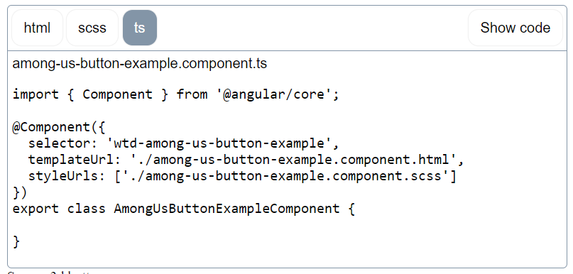
I created my first example component, which will be for a button called among-us-button. For now I won’t change the content of the example component.
ng g c components-examples/buttons/among-us-button-example --project doc
Then I created a component that will display the code snippet, I called it code-snippet and put it inside my module of shared component for my documentation.
ng g c shared-doc/code-snippet --project doc
Code snippet component
The code snippet component will have 2 inputs:
- The
source, which will be the folder where the example is located. In my casebuttons/among-us-button-example - The
file, which will be all the files that will be displayed. In my caseamong-us-button-example.component.tsandamong-us-button-example.component.htmlandamong-us-button-example.component.scss
On init the component will do a http request to get the files, then store the result inside a property.
import {Component, Input, OnInit} from '@angular/core';
import {HttpClient} from "@angular/common/http";
import {Observable, shareReplay} from "rxjs";

@Component({
  selector: 'wtd-code-snippet',
  templateUrl: './code-snippet.component.html',
  styleUrls: ['./code-snippet.component.scss']
})
export class CodeSnippetComponent implements OnInit {

  // The folder name of the component
  @Input() source: string | undefined;
  // The files extension to display, by default all files are displayed
  @Input() files: ('html' | 'scss' | 'ts')[] = ['html', 'scss', 'ts'];

  filesContent: { [key: string]: string } = {};

  constructor(private _http: HttpClient) {
  }

  ngOnInit(): void {

    // Fetch the content of the files
    for (let file of this.files) {
      this.fetchDocument(this.getUrlForFileType(file)).subscribe((data) => {
        this.filesContent[file] = data.trim();
      })
    }

  }

  getUrlForFileType(file: string): string {
    const folder = this.source;
    const filename = this.getFilename(file)

    return `/docs-content/${folder}/${filename}`;
  }

  getFilename(file: string): string {
    // the file name is the last part of the source url + the file extension
    return `${this.source?.split('/').slice(-1)}.component.${file}`;
  }

  fetchDocument(url: string): Observable<string> {
    return this._http.get(url, {responseType: 'text'}).pipe(shareReplay(1));
  }


}
Then the html of my component will first print the projected content, then will display the retrieved files.
<div>
  <div class="example-run">
    <ng-content></ng-content>
  </div>
  <div class="example-source">
    <div class="example-code" *ngFor="let file of files">
      {{getFilename(file)}}
      <ng-template [ngIf]="filesContent[file]">
        <pre>{{filesContent[file]}}</pre>
      </ng-template>
    </div>
  </div>
</div>
I also added a bit of css to make it easier to read, nothing really fancy I will do a better style later.
.example-run{
  border: 1px solid black;
}
.example-code{
  border: 1px solid black;
  pre{
    font-family: Consolas, "Andale Mono WT", "Andale Mono", "Lucida Console", "Lucida Sans Typewriter", "DejaVu Sans Mono", "Bitstream Vera Sans Mono", "Liberation Mono", "Nimbus Mono L", Monaco, "Courier New", Courier, monospace;
    white-space: pre-wrap;
  }
}
Using the code snippet component
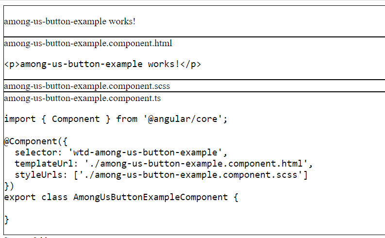
Finally I can use my component.
<wtd-code-snippet source="buttons/among-us-button-example">
  <wtd-among-us-button-example/>
</wtd-code-snippet>
Which will display the following result:
Adding some tabs
import {Component, Input, OnInit} from '@angular/core';
import {HttpClient} from "@angular/common/http";
import {Observable, shareReplay} from "rxjs";

@Component({
  selector: 'wtd-code-snippet',
  templateUrl: './code-snippet.component.html',
  styleUrls: ['./code-snippet.component.scss']
})
export class CodeSnippetComponent implements OnInit {

  // The folder name of the component
  @Input() source: string | undefined;
  // The files extension to display, by default all files are displayed
  @Input() files: ('html' | 'scss' | 'ts')[] = ['html', 'scss', 'ts'];

  filesContent: { [key: string]: string } = {};
  currentCodeTab!: string;
  showCode = false;

  constructor(private _http: HttpClient) {
  }

  ngOnInit(): void {

    // Set the first file as the current code tab
    this.currentCodeTab = this.files[0];

    // Fetch the content of the files
    for (let file of this.files) {
      this.fetchDocument(this.getUrlForFileType(file)).subscribe((data) => {
        this.filesContent[file] = data.trim();
      })
    }

  }

  getUrlForFileType(file: string): string {
    const folder = this.source;
    const filename = this.getFilename(file)

    return `/docs-content/${folder}/${filename}`;
  }

  getFilename(file: string): string {
    // the file name is the last part of the source url + the file extension
    return `${this.source?.split('/').slice(-1)}.component.${file}`;
  }

  fetchDocument(url: string): Observable<string> {
    return this._http.get(url, {responseType: 'text'}).pipe(shareReplay(1));
  }


}
<button class="action-button show-code" (click)="showCode = !showCode">Show code</button>
<div class="example-run" *ngIf="!showCode">
    <ng-content></ng-content>
</div>
<div class="example-source" *ngIf="showCode">
    <div class="example-tabs">
        <button class="action-button" *ngFor="let file of files" [class.active]="currentCodeTab===file" (click)="currentCodeTab=file">{{file}}</button>
    </div>
    <div class="example-code" *ngFor="let file of files" [class.active]="currentCodeTab===file">
        {{getFilename(file)}}
        <ng-template [ngIf]="filesContent[file]">
            <pre>{{filesContent[file]}}</pre>
        </ng-template>
    </div>
</div>
:host {
  display: block;
  border: 1px solid #8395a7;
  border-radius: 5px;
  position: relative;
  font-family: Arial, sans-serif;

  .show-code {
    position: absolute;
    right: 5px;
    top: 5px;
  }

  .action-button {
    cursor: pointer;
    -webkit-appearance: none;
    -moz-appearance: none;
    appearance: none;
    outline: none;
    border: none;
    font-family: inherit;
    font-size: 16px;
    font-weight: 500;
    background: white;
    border-radius: 11px;
    padding: 8px 13px;
    line-height: 24px;
    box-shadow: rgba(0, 0, 0, 0.05) 0px 0px 0px 1px;
  }

  .example-tabs {
    border-bottom: 1px solid #8395a7;
    padding: 5px;

    .action-button {
      margin-right: 5px;

      &.active {
        background: #8395a7;
        color: white;
      }
    }
  }

  .example-run {
    padding: 5px;
  }

  .example-code {
    padding: 5px;
    display: none;

    &.active {
      display: block;
    }

    pre {
      font-family: Consolas, "Andale Mono WT", "Andale Mono", "Lucida Console", "Lucida Sans Typewriter", "DejaVu Sans Mono", "Bitstream Vera Sans Mono", "Liberation Mono", "Nimbus Mono L", Monaco, "Courier New", Courier, monospace;
      white-space: pre-wrap;
    }
  }
}